How to Read a Price Chart
Price charts are one way to track the price action of the futures market. One of the most commonly used price charts is the candlestick chart.
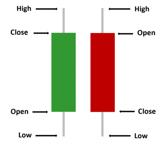
The diagram provided shows how to read both a green (bullish) and red (bearish) candlestick bar. The high/low of a candlestick bar is measured by the wick below and above the bars body. The open/close is based on where the bar began to form and where it ended. As you can see from the diagram, a bullish bar has the opposite open/close than a bearish bar.
A few popular bar types include minute, tick and range bars. Each bar type provides a different way to view and read the market. A minute bar for example, forms after each minute and shows how the price moved during that minute. This shows the trader the open, close, high and low for that time frame.
A range bar, on the other hand, is set to a certain number of ticks before it can be formed. For example, a range bar set to 5 ticks will create a new bar after the market has moved a total of 5 ticks.
A tick bar creates a new bar after a specified number of transactions are made. A tick chart set to 500 will create a new bar after 500 transactions.
Choosing which chart type to use should be based on your individual strategy and how you like to trade.
To dive deeper, please check out our NinjaTrader bar types page for various bar types and descriptions!
Reading Candlestick Shapes: The size of the body shows who was in control during the bar. A large green body means buyers pushed price well above the open, and a large red body means sellers pushed it well below. Long wicks show rejection: a long upper wick means price traded higher but could not hold there, and a long lower wick means lower prices were rejected. A bar with a very small body and wicks on both sides, often called a doji, shows indecision.
Reading the Trend: One candle on its own says very little. Look at the sequence of highs and lows. A series of higher highs and higher lows is an uptrend, a series of lower highs and lower lows is a downtrend, and overlapping bars that keep returning to the same prices are a range. The price scale on the right of the chart shows where each bar traded, and the time or bar count along the bottom shows how the bars were built.
Mistakes to Avoid: Avoid judging the market from a single bar, and avoid ignoring the bigger picture. Many traders check a higher timeframe first to see the overall trend and nearby support and resistance levels, then use a faster chart to time entries. Also keep in mind that the same move looks very different on a 1 minute, tick or range chart.
Frequently Asked Questions
What is the difference between a candlestick chart and a bar chart? Both show the open, high, low and close. A candlestick fills the area between the open and close with a colored body, while an OHLC bar marks the open and close with small flags. Our chart types guide covers these and other chart styles in NinjaTrader.
What chart should a beginner start with? A candlestick chart on a time based bar, such as a 1, 5 or 15 minute chart, is the most common starting point because it is easy to compare with charts and examples you will see elsewhere.
Why does the same candle look different on another platform? The open, high, low and close of each bar depend on the session times, time zone and data feed used to build it. A daily bar that starts at the overnight open will not match one that starts at the regular session open, so check your session settings before comparing charts.
What do the candle colors mean? A green (up) candle closed above its open and a red (down) candle closed below its open. The colors can be changed in the chart settings, so always check them when reading someone else’s chart.